Airline App Design Process 📈
The project was part of the UX Design Institute and Glasgow Caledonian University certification. FlyUX is a startup airline, and looking for an intuitive, fast, and easy experience.
Problem 💭
An airline was chosen as a case study, since the industry is packed with not so user-friendly designs. Users complaining about font sizes too small to read, not knowing that they
should click on the inbound and outbound on the same calendar, and showing flights that
are not available anymore.
should click on the inbound and outbound on the same calendar, and showing flights that
are not available anymore.
Solution 💡
Discovered user pain points, and solutions to their problem by making the user flow faster, and simplifying the user journey process.
Tools 🛠️
Adobe XD
Miro
Anima App
Roles 👩💻
UX Researcher
UX Designer
Research
Surveys 📊
After the project kickoff, I defined our research strategy and objectives. Understanding the target audience, their travel behavior, and pain points . First, I built an online survey and shared it in various relevant communities. In just a few days, I received 24 submissions. Based on these, I identified 5 common pain points, which lead us to the next step.
- Onsite Survey Tool Used: SurveyMonkey
- A total of 24 participants filled the survey, some were based in Dubai and some were from other parts of the world.
- Number of Questions: 10 Questions
- Types of Questions asked: Quantitative and Qualitative
Questions that participants were asked:
- When was the last time you visited an airline app?
- Why did you visit the airline app that day? What were you trying to do?
- Which airline apps do you usually use for booking flights?
- Were you able to complete the task that day?
- What do you like most and least about these apps? Please describe.
- What device do you usually use to book a flight?
- How many times have you booked a flight in a year?
- What is your priority when booking a flight?
- Do you travel for business or pleasure?
- What would you change about that app? What improvements would you make?
Here are some of the comments:
- Cluttered homepage.
- Lack of information presented.
- The important factors while choosing a flight are price, direct flights, date & time of flight.
- Users want an easy and smooth process without any hidden charges when reaching the payment process.
Note Taking 📝
A usability test was conducted on two users using Aer Lingus and Eurowings Apps. While watching the recordings I jotted down some notes like their background information, airline usage, tasks, and the walkthrough process of each participant. I also highlighted each users positive, negative, and important information.
What users had to say during their experience
I listed down the likes and dislikes of each user. Both users had different opinions and dislikes based on their backgrounds. We have participant 1 as a full time mother and travels once a year while as participant 2 is a hospitality manager and has to travel a lot for business purposes.
Usability Testing
Dr. Faiza Mahgoub was the participant for this usability test and she gave great feedback on these airline apps: Emirates and Korean Air.
The usability test followed a written script to help the tests run smoother. Here is an example of a task that the user had to perform using the Korean Air app:
"You live in Seoul, and you're planning to go on holiday and you think Istanbul in Turkey is a good place for you"
Analysis Phase
Affinity Diagram
I collaborated with a friend to sort out all the data collected from the competitive benchmark examples, online survey, note taking, and usability test. We used the tool Miro to organize and structure the data into different groups in the form of digital post it notes.
Customer Journey
The data collected from the Affinity Diagram was very useful when creating a Customer Journey Map. It helped in creating an effective visual map that reflected the customers' journeys through these channels that represented the different phases customers experience based on variety of dimensions, including customer sentiment, goals, and touch points.
User Flow Diagram
Created a step to step design to see how the user journey could be user-friendly to help them achieve their goals and addressed the issues highlighted in the customer journey map.
How the process went?
Sketched out the user flow. Each screen was represented by a box, and each action represented by a circle - for example the action of selecting a departure airport or adding an extra passenger.
Sketched the flow from the Homepage up to the Seat Selection page.
Recreated the digital flow using Miro.
Design Process
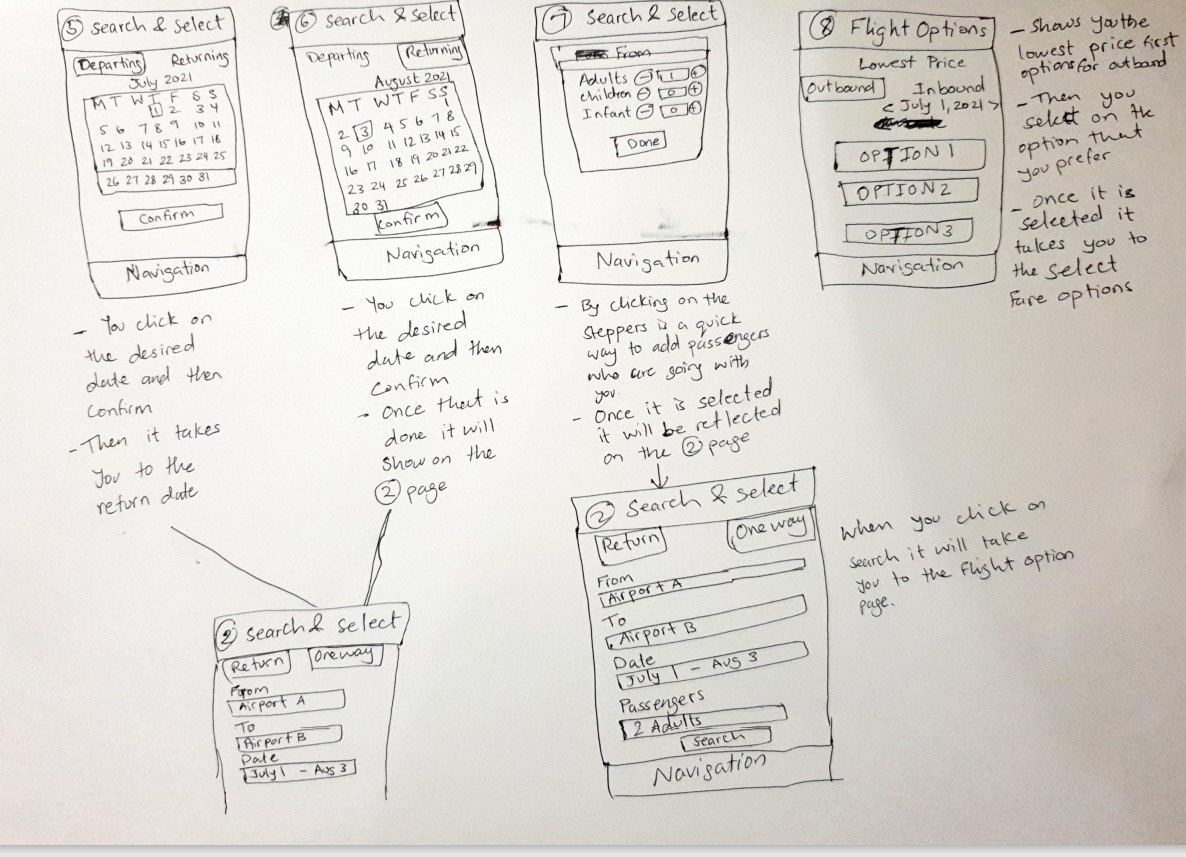
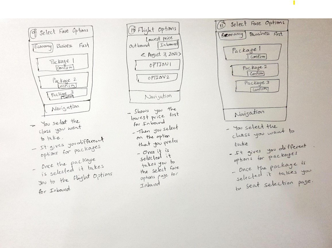
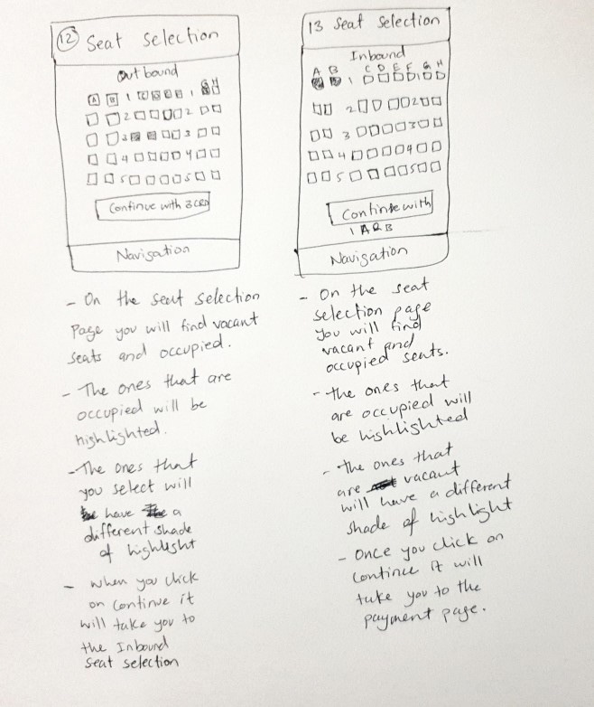
Low Fidelity Sketches
Here is the most important step before hitting on prototyping or making a wireframe.
Implementing the Flow diagram previously created has helped in designing this low fidelity sketch.
- Designed lists of screens based on the flow diagram. starting from searching for the flights up to choosing the seats for the flight.
- Included different screen states depending on the user's actions.
- Design each sketch until the flow has been completed.
- Made notes on each customer pain points from the research.
- Collected all of the sketches and scanned them.


Prototype
After finding out the solutions with the flow diagram and sketches. I went to the next step and added further details in the form of interactivity.
I was happy with the sketches, and started to design the prototype on Adobe XD. The aim here is to showcase the flight booking journey for two adults from searching for a flight to booking the seats.
Wireframes
After completing the prototype, I broke down each screen and explained each details and elements to the developer.
This part was a great help for the developers because it thoroughly showed how each element works, and was easily understood.
Learnings
I learned through compiling detailed research, and asking possible users about their struggle while using airline apps you would achieve the best solutions to your potential customers.
"Great work on your prototype, you've built it to a nice level of fidelity here. The prototype contains enough detail and interactivity to test the high level flow, the screen layouts and basic interactions. Nice work."
- Emily Jacquier, UX Design Institute