Case Study Section: Turning User Confusion Into a Clear, Culturally Aligned Experience
1️⃣ Project Background
Springs15 was a UAE-based platform inspired by Kickstarter, aimed at helping creators launch new ideas and receive community support.
However, during early user sessions and informal feedback rounds, we discovered a fundamental challenge:
Most users in the UAE did not understand the concept of “crowdfunding,” “backing,” or the role of a “creator.”
This confusion prevented users from completing actions on the website.
2️⃣ Problem Identified Through User Feedback
Key Insights
Users repeatedly expressed:
“What does it mean to back a project?”
“Am I buying something or donating?”
“Who is the creator and what do they do?”
“I don’t understand this platform. What am I supposed to do?”
This showed a cultural and conceptual gap, not a UI issue alone.
3️⃣ Design Goal
Transform the platform from:
“Crowdfunding concept that users didn’t understand”
→
“Clear, intuitive, buy-like experience familiar to UAE users.”
“Crowdfunding concept that users didn’t understand”
→
“Clear, intuitive, buy-like experience familiar to UAE users.”
My objective was to reduce cognitive load, simplify terminology, and introduce supporting material to educate first-time users.
4️⃣ My Design Response
Based on real user feedback, I redesigned the platform with three strategic improvements:
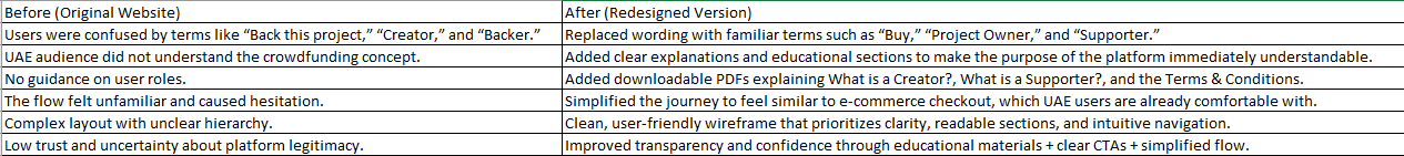
✔ 1. Replaced confusing terminology with culturally familiar language
Instead of Back this Project → Buy This / Support This Project
Reframed “Creator” to Project Owner
Reframed “Backer” to Supporter
This instantly increased comprehension during testing.
✔ 2. Redesigned Wireframes with a More User-Friendly Flow
On Miro, I mapped a simplified structure:
Clear hero section explaining how the platform works
Action-driven CTAs placed at the top and bottom
Project cards with straightforward labels
Step-by-step support flow (mirroring a familiar e-commerce checkout)
The wireframe focused on clarity, hierarchy, and removing jargon.
✔ 3. Added Downloadable PDFs for Education & Transparency
To build trust and reduce confusion, I introduced new informational assets:
“What is a Creator?” (explaining the role)
“What is a Supporter?” (explaining how supporting works)
Clear Terms & Conditions in downloadable format
This helped users—especially first-time platform visitors—understand the concept offline or share it with others.
5️⃣ Before vs After (How You Should Present It Visually)
You can show this as:
6️⃣ Outcome
After the redesign:
Users understood the platform much more quickly
Terminology confusion dropped significantly
Users felt more confident interacting with the platform
The educational PDFs improved trust and clarity
The e-commerce-like flow aligned better with UAE digital habits